Week 9- The walrus office
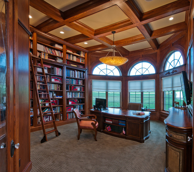
This week i was tasked with something new, i had to redesign the walrus office, as the one that was made by another group was not wanted by the client, and the other group did not have enough time to redesign their scene, so i was passed the mantle, the walrus scene looks pretty simple as all i have to do is. The client didnt like the previous version of the office as they felt it was too colourful, and they wanted a more vintage approach, to match this request, i began my research into the office by looking at old rooms and aesthetics to get an idea of what they wanted from me. below is what i found during my research


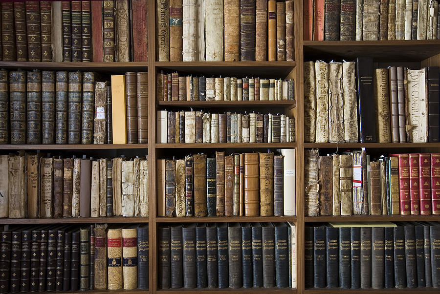
I then began looking at Libraries as i really liked the look of lots of books on built in shelves, as i felt it helped with the old school aesthetic i was try to achieve as well as adding a bit of colours to the piece as books will be of various colours and shapes and sizes.


Now that i feel that i have compiled enough research to get going i opened up Photoshop and began my work designing my scene. below is my first concept for the room, i used a combination of photo textures as well as my own painting, i began with a ochre background and used a perspective grid to create the layout of the room, i then took a photo of a bookscase, duplicated it and added it to fit the bookcases i have designed, i did the same for the door and wall, i then added some textures to the floor, and then manually painted some brighter binders, as well as library ladders on the other side. i was very happy with how the room was looking,


I then began looking at Libraries as i really liked the look of lots of books on built in shelves, as i felt it helped with the old school aesthetic i was try to achieve as well as adding a bit of colours to the piece as books will be of various colours and shapes and sizes.


Now that i feel that i have compiled enough research to get going i opened up Photoshop and began my work designing my scene. below is my first concept for the room, i used a combination of photo textures as well as my own painting, i began with a ochre background and used a perspective grid to create the layout of the room, i then took a photo of a bookscase, duplicated it and added it to fit the bookcases i have designed, i did the same for the door and wall, i then added some textures to the floor, and then manually painted some brighter binders, as well as library ladders on the other side. i was very happy with how the room was looking,
Upon being given feedback i was told i needed to add a plaque to the door with a very elaborate and log phrase on it, which nearly takes up the whole door, any smaller and people wouldnt be able to read while the animation is on tour,
Once this was done it tried to add ambience to the room by adding specs of dust which i added using one of the many photoshop brushes i have downloaded and installed throughout the years
Here i added more larger and smaller ones to give a sense of depth, from where the camera is positioned
Here i made the door larger to make the plaque easier to read, and also corrected the frame to the correct aspect ratio, unlike the underwater scene the camera does not need to be panned therefore i can do the ratio editing in photoshop instead of AE as i am much more adept at PS.


Comments
Post a Comment